Ever bought a shirt that looked amazing in the store, only to find it looks…different at home? The culprit might not be your eyes – it could be the lighting! Specifically, it might be the Color Rendering Index, or CRI, of the lights. CRI is a super important factor in how we see colors, and it plays a big role in everything from how inviting your living room feels to how well you can see while working on a project. This guide will tell you everything you need to know about CRI.
Lighting is about more than just brightness. It’s about how well that light shows the true colors of everything around you. Whether you’re picking out paint colors, displaying products in a store, or even performing surgery, the accuracy of color is way more important than you might think. And with the rise of LED lighting, understanding CRI has become even more crucial. This guide will walk you through it all, step by step.
This is your complete guide to understanding CRI. We’re covering what it is, how it’s measured, why it’s so important, and how to choose the right CRI for your specific needs. You’ll learn how to use this knowledge to pick the best lighting, every time. Let’s get to it!
What is the Color Rendering Index (CRI)?
Let’s start with the basics. The Color Rendering Index, or CRI, is simply a way to measure how well a light source shows colors accurately. Think of it like a “color accuracy score” for lights.
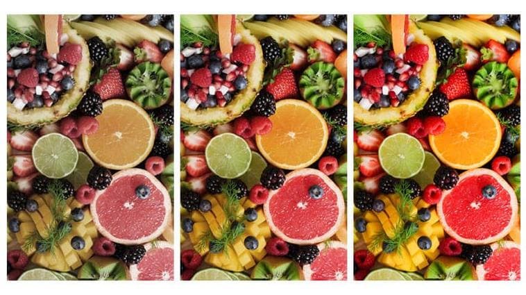
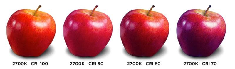
Imagine a bright red apple. Under natural sunlight, it looks vibrant and, well, red. But under some artificial lights, that same apple might look duller, or even a slightly different shade of red. That’s where CRI comes in. It tells us how close the light source comes to showing colors the way sunlight would.
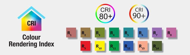
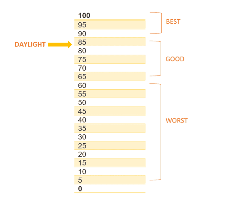
The 0-100 Scale:
- CRI is measured on a scale from 0 to 100.
- A CRI of 100 means the light shows colors exactly like natural daylight would. It’s the gold standard!
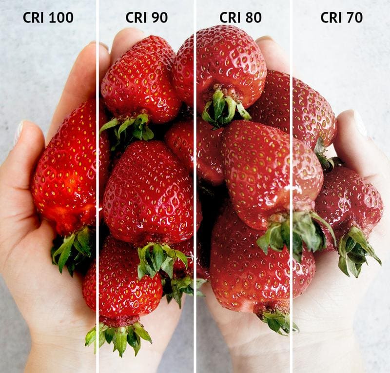
- Lower numbers mean the colors will look less accurate, more washed out, or just… off.
- Generally, a CRI of 80 or above is considered pretty good for most everyday uses.
- A CRI of 90 or above is considered excellent and is needed when color accuracy is really important.
CRI vs. Color Temperature (Kelvin) – Don’t Get Them Confused!
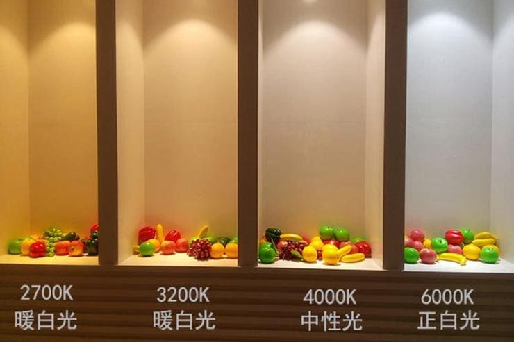
This is a super common point of confusion, so let’s clear it up right now. Color temperature (measured in Kelvin, or K) tells you how “warm” or “cool” the light itself looks. Think of the warm, yellowish glow of a candle (low Kelvin) versus the bright, bluish-white light of a cloudy sky (high Kelvin).
A simple rule of thumb: If you want lighting that feels like candlelight or sunset, opt for lower Kelvin values. For a bright, alert environment, go higher.
CRI, on the other hand, is about how that light renders the colors of objects. You could have two light bulbs with the exact same color temperature (say, a warm 3000K), but one might have a CRI of 70 and the other a CRI of 95. The 95 CRI bulb will make colors look much more true-to-life, even though the color of the light itself is the same.
Why is CRI Important?
In short, CRI affects how we see the world around us. It impacts:
- Aesthetics: Makes colors look more vibrant and natural.
- Visual Comfort: Reduces eye strain and makes it easier to see clearly.
- Productivity: Helps you focus and work more effectively, especially in tasks that require accurate color perception.
- Safety: In some settings (like factories), accurate color rendering is crucial for safety.
- Well-being: Good lighting can even affect your mood!
How is CRI Measured?
Okay, so how do we actually get that CRI number? It’s a bit technical, but we’ll break it down.
The CIE Standard (CIE 1995):
The International Commission on Illumination (that’s the CIE) created the standard method for measuring CRI. It’s been around for a while, and it’s the most common way CRI is measured.
Test Color Samples (TCS):
Imagine a set of paint swatches – those are kind of like the Test Color Samples (TCS) used to measure CRI. The original CRI method uses eight specific pastel colors. These are called R1 through R8.
The method for calculating CRI is very similar to the visual assessment example given above, but is done via algorithmic calculations once the spectrum of the light source in question is measured.
The color temperature for the light source in question must first be determined. This can be calculated from spectral measurements.
The color temperature of the light source must be determed so that we can select the appropriate daylight spectrum to use for comparison.
Then, the light source in question will be virtually shone onto a series of virtual color swatches called test color samples (TCS) with the reflected color measured.
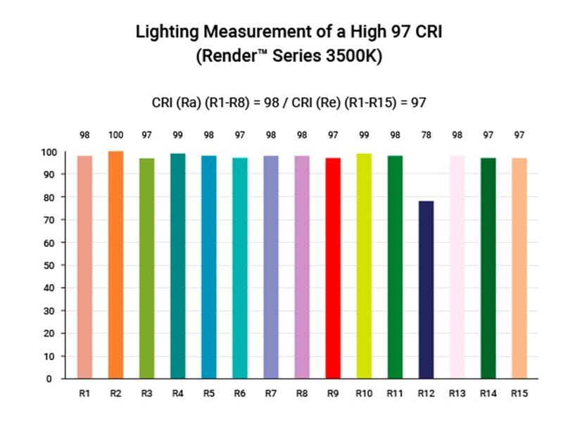
The R-Values (R1-R15):
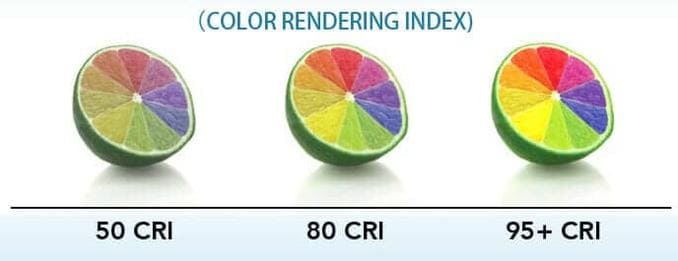
Each of those color samples (R1-R8) gets a score, called an “R” value. This score shows how well the light source renders that specific color. A perfect score is 100.
There’s also something called “Extended CRI,” which uses 15 R values (R1-R15). The most important one to pay attention to is R9, which represents red. Many light sources, especially older LEDs, struggle to render red well, so a high R9 value is a good sign.
We will also have ready the series of virtual reflected color measurements for natural daylight of the same color temperature.
Finally, we compare the reflected colors and formulaically determine the “R” score for each color swatch.
Calculating General CRI (Ra) and Extended CRI:
The “General CRI,” often written as Ra, is simply the average of the first eight R values (R1-R8). It’s the number you usually see on light bulb packaging.
Extended CRI is calculated using all 15 R values. It gives a more complete picture, but it’s not as commonly used.
The Role of Spectrophotometers:
To measure all these colors and get those R values, you need a special instrument called a spectrophotometer. This device measures the spectral power distribution (SPD) of the light. Think of SPD as a “fingerprint” of the light, showing how much of each color is present.
Reference Light Sources: Daylight vs. Planckian Radiation:
Here’s a key point: CRI is always measured relative to a reference light source. That means we’re comparing the light being tested to a “perfect” light source.
- For light sources with a color temperature of 5000K and above, the reference is daylight.
- For light sources below 5000K, the reference is something called a “Planckian radiator.” This is basically a fancy term for a light source that produces light by heating up, like an old-fashioned incandescent bulb. This is because incandescent light is a good representation of “warm” light.
But what if we have a 3000K LED lamp and want to measure its CRI?
The CRI standard dictates that color temperatures 5000K and greater use a daylight spectrum, but for color temperatures less than 5000K, use the Planckian radiation spectrum.
Planckian radiation is essentially any light source that creates light by generating heat. This includes incandescent and halogen light sources.
So when we measure the CRI of a 3000K LED lamp, it is being judged against a “natural” light source that has the same spectrum as a 3000K halogen spotlight.
(That’s right – despite the awful energy efficiency of halogen and incandescent bulbs, they produce a full, natural and excellent light spectrum).
The Importance of CRI in Different Applications
Now that we know what CRI is and how it’s measured, let’s talk about why it matters in the real world. The ideal CRI depends heavily on where and how the light will be used.
Residential Lighting
In your home, CRI affects how inviting and comfortable your space feels. It also impacts how well you can see to perform everyday tasks.
- Living Rooms: A CRI of 80+ is usually fine, but 90+ will make your furniture, décor, and artwork look their best. It creates a more vibrant and welcoming atmosphere.
- Bedrooms: Similar to living rooms, 80+ is acceptable, but 90+ will enhance the colors and create a more relaxing environment.
- Kitchens: Here, CRI becomes more important. You want to see the true colors of your food! Aim for 90+ for the best results.
- Bathrooms: Good CRI (90+) is crucial for tasks like applying makeup or shaving. You want to see your skin tone accurately.
- Home Offices: If you work from home, good CRI (80+, or even 90+ if you do color-critical work) can reduce eye strain and improve productivity.
Commercial Lighting
In businesses, CRI can have a direct impact on the bottom line. It affects customer perception, employee productivity, and even sales.
- Retail Stores (Clothing, Jewelry, Grocery, etc.): High CRI (90+) is essential. It makes products look more appealing and helps customers see the true colors, leading to more sales and fewer returns. Imagine trying to buy clothes under lighting that makes everything look dull or discolored!
- Offices and Workspaces: Good CRI (80+) can improve employee focus, reduce eye strain, and create a more pleasant work environment. This can lead to increased productivity.
- Restaurants and Cafes: CRI affects the perceived quality of the food and the overall ambiance. 90+ is recommended to make food look its most appetizing.
- Hotels and Hospitality: High CRI (90+) creates a more luxurious and welcoming atmosphere, enhancing the guest experience.
Industrial Lighting
In industrial settings, CRI is often about safety and efficiency.
- Warehouses: While super-high CRI isn’t always necessary, a CRI of 70-80+ is important for visibility and safety. Workers need to be able to see clearly to avoid accidents.
- Factories: Depending on the type of work, CRI can be crucial. If workers are dealing with color-coded wires or materials, accurate color rendering is essential for safety and preventing errors. Aim for 80+ or 90+ in these cases.
- Manufacturing Facilities: Similar to factories, high CRI (90+) may be needed for quality control and tasks that require precise color matching.
Healthcare Lighting
In healthcare, CRI is about much more than just aesthetics. It can directly impact patient care.
- Hospitals: High CRI (90+) is crucial for accurate diagnosis. Doctors need to be able to see subtle differences in skin tone and other visual cues.
- Dental Clinics: Extremely high CRI (95+) is needed for matching tooth shades and performing dental procedures.
- General Practices: Similar to hospitals, high CRI (90+) is important for accurate assessment of patients.
Art and Display Lighting
When showcasing art or other valuable items, accurate color rendering is paramount.
- Museums: High CRI (95+) is essential to preserve the artist’s intent and allow visitors to see the artwork as it was meant to be seen.
- Art Galleries: Similar to museums, high CRI (95+) is crucial for showcasing artwork and attracting buyers.
- Photography Studios: High CRI (95+) lighting is needed for accurate color reproduction in photographs.
Outdoor Lighting
Even outdoors, CRI can play a role, although it’s often less critical than in indoor settings.
- Street Lighting: A CRI of 70-80 is generally acceptable for basic visibility and safety.
- Parking Lots: Similar to street lighting, 70-80 CRI is usually sufficient.
- Security Lighting: While brightness is the primary concern, a moderate CRI (70+) can help with identifying people and objects.
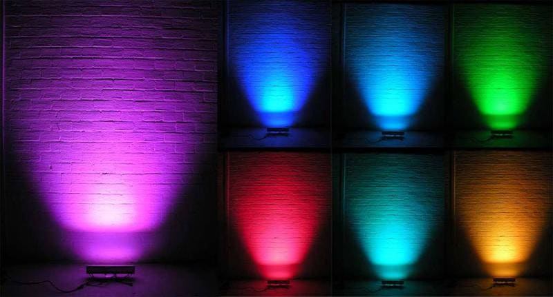
CRI and LED Lighting
LED lighting has revolutionized the industry, and it’s important to understand how CRI fits into the picture.
The Rise of LEDs and the Importance of CRI:
In the past, incandescent bulbs were common, and they had a naturally high CRI (close to 100). But they were also very inefficient. When LEDs started becoming popular, many early models had poor CRI, leading to complaints about washed-out colors and an unnatural look.
This is why understanding CRI is so important with LEDs. You can’t just assume that an LED bulb will have good color rendering. You need to check the CRI rating.
Advantages of LEDs in terms of CRI:
The good news is that LEDs can achieve very high CRI values (90+). Modern LED technology allows for precise control over the light spectrum, making it possible to create LEDs that render colors beautifully.
Challenges with LED CRI:
The challenge is that not all LEDs are created equal. Cheaper LEDs often have lower CRI values. They might also have uneven spectral distribution, meaning they render some colors well but others poorly (especially red, as mentioned earlier).
High-CRI LEDs: What to Look For:
- Check the CRI rating on the packaging. Don’t just assume it’s good!
- Look for R9 values, if available. A high R9 (90+) is a good indicator of overall color quality.
- Consider reputable brands. They are more likely to provide accurate CRI information and use higher-quality components.
Beyond CRI: Other Color Quality Metrics
While CRI is the most widely used metric, it’s not perfect. There are other ways to measure color quality, and some of them are becoming increasingly important.
TM-30-15: A More Comprehensive Approach:
TM-30-15 is a newer method developed by the Illuminating Engineering Society (IES). It’s considered a more comprehensive way to assess color rendering.
- 99 Color Samples: Unlike CRI, which uses 8 or 15 color samples, TM-30-15 uses a whopping 99 color samples. This gives a much more detailed picture of how a light source renders different colors.
- Fidelity Index (Rf): This is similar to CRI’s Ra. It measures color accuracy. A score of 100 is perfect.
- Gamut Index (Rg): This is something CRI doesn’t measure. Rg measures color saturation. It tells you how vivid or dull colors will appear. A score of 100 means the saturation is the same as the reference light source. Scores above 100 mean colors are more saturated, and scores below 100 mean colors are less saturated.
- Color Vector Graphics: TM-30-15 also provides a visual representation of color rendering, it’s like a map showing how different colors are shifted or distorted by the light source. This is super helpful for understanding the nuances of color rendering.
Color Quality Scale (CQS):
The Color Quality Scale (CQS) was developed by the National Institute of Standards and Technology (NIST). It uses 15 saturated color samples, unlike CRI’s pastel samples. This is meant to address some of the limitations of CRI, particularly its weakness in representing saturated colors.
Gamut Area Index (GAI):
GAI focuses solely on color saturation. It measures the overall range of colors a light source can produce. It doesn’t tell you about accuracy, but it tells you how vivid colors will be.
Comparing CRI, TM-30-15, CQS, and GAI:
| Metric | What it Measures | Number of Color Samples | Strengths | Weaknesses |
|---|---|---|---|---|
| CRI (Ra) | Color Accuracy (average) | 8 (pastel) | Widely used, simple to understand | Doesn’t capture nuances, weak on red (R9) |
| TM-30-15 (Rf) | Color Accuracy | 99 | More comprehensive, better representation of a wider range of colors | More complex to interpret |
| TM-30-15 (Rg) | Color Saturation | 99 | Provides information on vividness of colors | More complex to interpret |
| CQS | Color Fidelity (focus on saturated colors) | 15 (saturated) | Addresses some of CRI’s limitations, better for saturated colors | Not as widely adopted as CRI |
| GAI | Color Saturation (overall range) | N/A | Simple measure of vividness | Doesn’t measure accuracy |
Choosing the Right CRI for Your Needs
So, how do you put all this information to use? Here’s a step-by-step guide to choosing the right CRI:
Step 1: Define Your Application
Ask yourself these key questions:
Are colors important for your brand?
Some businesses rely on specific colors to define their brand identity, often employing them in marketing materials. Consistent color representation in your project helps create the desired atmosphere that resonates with customers.
For businesses like restaurants and agencies that use specific color combinations, it’s crucial to have a CRI that accurately reflects the brand’s identity.
Would the customer/visitors’ behavior be affected by the colors?
In retail and merchandising, the primary goal is to increase sales by considering factors that influence customer behavior. A high color rendering index (CRI) is crucial for enabling customers to accurately assess the colors of clothing, makeup, apparel, home décor, and other items.
Customers are more likely to spend time in your store and make a purchase when the lighting quality enhances the product display. This is relevant for any retail setting, including fruit and food markets, jewelry stores, grocery stores, and shop windows. Opt for a higher CRI of 90 or above wherever accurate color rendition is important and aesthetics need to be improved.
Is the safety of people in your project important?
In projects where employee safety is paramount, high-quality lighting with a high CRI is essential. Workers in factories and industries often handle dangerous equipment and machinery, engaging in processes like cutting, welding, moving heavy items, and melting materials.
Properly lit areas are crucial in these scenarios, as workers are frequently exposed to potential hazards during work hours. Even minor visibility issues can lead to severe consequences and fatal accidents. While higher wattage is important, CRI plays a significant role in ensuring better visibility. Even with lower wattage bulbs, accurate visibility can be achieved.
Always prioritize the use of high-quality lights with a CRI greater than 90 for such applications to ensure maximum safety.
Do your workers/employees need high visibility?
In hospitality projects such as offices, enterprise buildings, schools, universities, and industries, lighting should enable effortless visibility. The right lighting enhances productivity and minimizes the risk of eye strain and disorders.
In warehouses and inventories, where products are stored, packaged, and shipped, workers need to quickly identify items and categorize SKUs. Inadequate lighting and poor visibility can delay schedules, leading to poor performance and delayed deliveries.
If your application involves precise work and extended periods of stay, choose a high CRI lighting of 80-90. Other scenarios, like spray booths, printing facilities, or art workshops, require clear and accurate colors for painters and artists to work effectively.
CRI is particularly important in indoor applications. Tasks such as studying, reading, or cooking in the kitchen demand high-quality lighting with high CRIs to ensure optimal performance and comfort.
In contrast, for outdoor areas like car parking lots, garages, and street lighting, a CRI of 70-80 is sufficient. While illumination is necessary for easy navigation and security, high color fidelity is not as critical in these settings. In such cases, factors like light output, lumens, and wattage take precedence over CRI.
Step 2: Consider Color Temperature
Think about the mood you want to create. Warmer color temperatures (2700K-3000K) are cozy and relaxing, while cooler color temperatures (4000K-5000K) are more energizing and promote focus. Choose a color temperature that suits the application, then consider CRI.
Step 3: Understand Minimum CRI Requirements
Here’s a general guideline:
- 80+ CRI: Good for general use in homes, offices, and many commercial spaces.
- 90+ CRI: Excellent for color-critical applications like retail, art galleries, healthcare, and any task where accurate color perception is essential.
Step 4: Factor in Budget
High-CRI lighting can be more expensive, but the benefits often outweigh the cost, especially in the long run. Consider the value of improved aesthetics, productivity, or sales.
Step 5: Test and Compare
This is the most important step! If possible, get samples of different lighting products and test them in your actual space. See how the colors look with your own eyes. Don’t rely solely on numbers on a spec sheet.
| Project type | Examples | CRI Range |
|---|---|---|
| Indoor/Residential | Kitchen, study room, bedrooms, lounges | 80-90 |
| Hospitality | Restaurants, cafes, motels, hotels | 80-95 |
| Retails/Merchandising | Malls, fashion stores of all kinds, car showcases, art displays | 90+ |
| Business | Offices, schools, studios, hospitals, photography | 90-97 |
| Industries | Chemical/metal industries, production factories | 90+ |
| Others | Parking, garages, warehouses, and backyards | 70-80 |
The Future of CRI and Color Quality
The world of lighting is constantly evolving, and so is the science of color rendering.
Advancements in LED Technology:
Researchers are constantly working to improve the spectral output of LEDs, making them even better at rendering colors accurately. This includes developing new phosphor blends and other innovative technologies.
The Role of Quantum Dots:
Quantum dots are tiny nanocrystals that can be used to “tune” the light emitted by LEDs. They offer the potential for extremely precise control over the light spectrum, leading to even higher CRI values and better color quality.
Tunable White Lighting and CRI:
Tunable white lighting systems allow you to adjust the color temperature of the light and sometimes even the CRI. This gives you incredible flexibility to customize the lighting for different tasks and moods.
Smart Lighting and CRI Control:
Smart lighting systems can be programmed to automatically adjust CRI based on the time of day, the activity taking place, or even the colors of the objects in the room. This opens up exciting possibilities for optimizing lighting for both aesthetics and functionality.
The Potential of AI in Color Quality Assessment:
Artificial intelligence (AI) could play a role in developing even more sophisticated color quality metrics and automating the process of lighting design. Imagine AI algorithms that can analyze a space and automatically recommend the optimal lighting solution, taking CRI and other factors into account.
Regulatory Standards and CRI
To ensure quality and consistency, several organizations have established standards and guidelines related to CRI.
- Energy Star: This program, run by the U.S. Environmental Protection Agency (EPA), sets minimum CRI requirements for lighting products to qualify for the Energy Star label. This helps consumers identify energy-efficient and high-quality lighting. Look for this Energy Star.
- European Union Ecodesign Directive: The EU has regulations that set requirements for energy efficiency and CRI for certain lighting products sold within its member states.
- IEC Standards: The International Electrotechnical Commission (IEC) develops standards for electrical technologies, including methods for measuring and calculating CRI.
- CIE Recommendations: The International Commission on Illumination (CIE), the organization that developed the original CRI standard, continues to publish recommendations and technical reports related to color quality.
Frequently Asked Questions (FAQ) about CRI
What is a good CRI for LED lights?
It depends on the application! For general use, 80+ is good. For tasks requiring accurate color perception (like art studios or retail displays), 90+ is recommended.
Is higher CRI always better?
Generally, yes, but there are exceptions. For some applications (like street lighting), very high CRI isn’t necessary. Also, extremely high CRI can sometimes come at the expense of energy efficiency.
Can I use low-CRI lights anywhere?
Yes, in areas where color accuracy isn’t critical, like hallways, storage rooms, or outdoor areas where basic visibility is the main concern.
How does CRI affect my energy bill?
High-CRI LEDs can be slightly less energy-efficient than low-CRI LEDs, but the difference is often small. The benefits of better color rendering usually outweigh the slight increase in energy consumption, especially with modern LED technology.
What is the difference between CRI and Ra?
Ra is the general CRI. It’s the average of the first eight R values (R1-R8). They are often used interchangeably.
What is the best CRI for eyes?
There is not a specific “best” value in terms of preventing damage. However, for visual comfort and reducing eye strain, a CRI of 80+ is generally recommended, and 90+ is even better, especially for tasks requiring prolonged visual attention.
What CRI do artists use?
Artists typically require very high CRI lighting (95+) to accurately perceive and work with colors. This ensures their artwork is seen in its truest form.
Conclusion
The Color Rendering Index (CRI) is a crucial, yet often overlooked, aspect of lighting. It’s the key to unlocking the true beauty and vibrancy of the world around us. By understanding CRI, you’re no longer just choosing light bulbs – you’re crafting an experience.
From the cozy warmth of your home to the bustling energy of a retail store, CRI shapes how we perceive and interact with our surroundings. It influences our mood, our productivity, and even our purchasing decisions. High-quality CRI lighting makes colors pop, reduces eye strain, and creates a more inviting and functional environment.
So, the next time you’re choosing lighting, remember the power of CRI. Don’t settle for dull, inaccurate colors. Look for that CRI rating, consider your needs, and choose lighting that brings out the best in your space. It’s an investment that pays off in countless ways.
The future of lighting is bright (and accurately colored!). With ongoing advancements in LED technology, quantum dots, and smart lighting controls, we can expect even greater precision and flexibility in color rendering. This means more beautiful, functional, and healthy environments for everyone.
Ready to transform your space with the perfect lighting? Start exploring your options today!