Ever walked into a room and felt instantly cozy, like you just wrapped yourself in a blanket of warm light? Or maybe you entered a space that felt cold and clinical, like a scene straight out of a sci-fi movie? That’s not magic—it’s color temperature at work. Whether you’re chilling in your living room, working late in the office, or navigating the brightly lit aisles of a store, the color temperature of your lighting is pulling some serious strings behind the scenes. It’s the unsung hero of ambiance, mood, and even productivity.
Think of light as the silent mood-setter. Too warm, and you’re nodding off on the couch. Too cool, and you’re squinting like you’re in a hospital under examination lights. Getting the right color temperature is key to making sure your space feels just right, whether you’re going for cozy vibes or sharp focus.
But it doesn’t stop at just the vibes. Choosing the right color temperature is about function, too. The kind of light you need when you’re binge-watching a series on the couch is totally different from what you want when you’re trying to be productive at work. Lighting isn’t one-size-fits-all—it’s all about picking the right glow for the right moment. And once you unlock the power of color temperature, you’ll wonder how you ever lived in such poorly lit ignorance.
What Is Color Temperature? The Secret Sauce Behind Your Lighting
Color temperature might sound like something straight out of a physics textbook, but it’s the VIP pass to understanding why your room feels either cozy or like a sterile spaceship. Technically speaking, color temperature—also known as CCT (Correlated Color Temperature)—is a fancy term that describes how “warm” or “cool” your light looks. Imagine it as the personality of your light source. Is it warm and inviting, or cold and business-like? Spoiler alert: It’s all about the vibe.
How Color Temperature Is Measured: Welcome to Kelvin Land
Now, here’s where things get a bit “sciencey”—but stick with it, because this is the key to cracking the lighting code. Color temperature is measured in kelvins (K), and the higher the number, the cooler the light. Yes, it’s a bit backward, but bear with us. Low kelvins, say around 2000K to 3000K, give off that warm, golden glow that makes you want to curl up with a book. Higher kelvins, like 6000K and up, flood the room with a bluish, crisp light that feels more like a mid-day stroll under the sun—if the sun were fluorescent.
Warm vs. Cool: The Great Lighting Debate
Here’s the deal: lower kelvin numbers bring all the warmth. Think candlelight, fireplaces, and sunsets—they’re soft, cozy, and perfect for setting the mood in living rooms, bedrooms, or anywhere you want to unwind. On the flip side, when the kelvin scale skyrockets, so does the coolness. We’re talking crisp, almost icy blues that mimic the light from a clear blue sky at noon. It’s the kind of brightness that keeps you alert and sharp, perfect for task lighting in offices, kitchens, and workspaces where you need to get stuff done without feeling like you’re in a romantic, soft-focus film.
So, the next time you’re picking out lights, remember: you’re not just picking bulbs, you’re curating your atmosphere. And with the right color temperature, you can make any space feel exactly how you want it—be it warm and fuzzy or sharp and focused.
The Technical Twists of Color Temperature: Why Warm Feels Cool (and Vice Versa)
Why Higher Kelvins Mean Cooler Light—The Mind-Bending Truth
Here’s where things get a little quirky: the higher the kelvin number, the cooler the light. Wait, what? Shouldn’t more heat mean warmer light? Well, not exactly. Picture it like this: the lower end of the CCT scale, around 2000K to 3000K, gives off a lovely, soft glow—think candles, cozy campfires, and that nostalgic golden hour right before sunset. It’s warm, inviting, and has a chill, kick-back vibe. But as the kelvin count climbs, the light moves from warm to something a bit… frostier. By the time you hit 6500K, your room will look like it’s basking in a clear, icy blue sky. It’s clean, crisp, and slightly intimidating—like staring into the eyes of a Siberian Husky.
And why does it flip-flop like this? It’s all thanks to physics! In reality, hotter temperatures (like blue flames) burn way brighter and hotter than a simple red flame. So, while it feels backward, it’s actually pure science doing its thing.

The Warm-Cool Color Confusion: Why Humans Think Yellow is Toasty and Blue is Chill
Here’s the fun part—humans are weird. When we think “warm,” we think of cozy things like fire, sunsets, and that soft amber glow you get when you’re roasting marshmallows over a campfire. “Cool” makes us think of crisp snow, icy winter mornings, and cool blue waters. So, naturally, our brains have tied yellowish light with warmth and bluish light with chilliness, even though in the world of thermodynamics, it’s exactly the opposite.
Blame it on our caveman ancestors, who huddled around flames for warmth and saw ice-cold skies above. Now, thanks to our deeply ingrained psychology, we associate reds, oranges, and yellows with warmth, while blues and whites scream “cool” (despite that sizzling blue flame from your gas stove being much hotter than any orange one).
So, while your light bulbs are scientifically telling you that blue is hot, your brain is over here insisting that it’s cold. Typical.
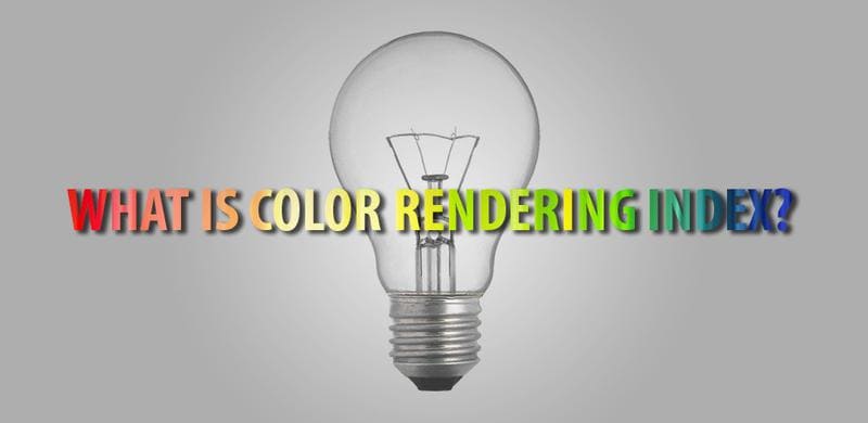
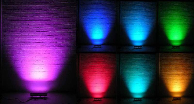
The White Light Scale: Color Rendering Index (CRI) Demystified
Vamos falar sobre Índice de reprodução de cores (CRI), the unsung hero of light quality. Think of CRI as the “how good does this light make everything look?” scale. It’s a number between 0 and 100 that measures how accurately a light source shows colors compared to natural daylight. You know how sometimes under bad lighting, your shirt looks a different color or your skin suddenly has an alien-like tint? Yeah, that’s low CRI playing tricks on you. The higher the CRI, the more true-to-life everything appears, and the less likely you are to look like a poorly lit movie villain.
CRI 0-70: The Lighting Black Hole
Ah, the CRI 0-70 range—where light goes to die. This is your low-quality lighting zone. If you’ve ever been in a room lit by mercury vapor lights or low-pressure sodium vapor bulbs, you know the drill. Colors get distorted, and everything takes on a dull, grayish hue. It’s like living in a world permanently filtered by an Instagram preset called “Bleak & Boring.” These types of lights are energy-efficient, sure, but they’re definitely not doing your interior design (or your selfies) any favors.
CRI 70-90: The Solid, Everyday Performer
Now we’re stepping into more tolerable territory—CRI 70-90. This is where you’ll find your trusty LEDs, fluorescent lights, and other standard-quality lighting sources. It’s not perfect, but it’s good enough to show most colors without making them look like they’ve been washed in dishwater. In other words, your reds will still look red, and your blues won’t get mistaken for purples. This range is perfect for offices, schools, and places where you need functionality but aren’t throwing an art show.
CRI 90-100: The Lighting Dream Team
And here we are, at the top of the lighting food chain—CRI 90-100. This is the elite club of lighting, featuring high-fidelity LED lamps and good ol’ incandescent bulbs. Lights in this range render colors so accurately, you’d think they were painting a masterpiece in real-time. Everything looks crisp, vibrant, and full of life, like you just stepped into a high-definition movie. This is the kind of lighting you want in spaces where color is critical—think art galleries, makeup studios, and anywhere you need to see the full spectrum of hues in all their glory. It’s basically a backstage pass to the true color concert.
Choosing the Right LED Color Temperature: Your Light, Your Vibe
Lighting isn’t just about turning on a switch; it’s about setting the mood, creating an atmosphere, and getting stuff done in style. Whether you want to kick back and relax or sharpen your focus for a major project, picking the right LED color temperature is the key to making your space work for you. Let’s break it down by kelvin range—because life’s too short for bad lighting.
Low Color Temperature (2000K – 3500K): The Cozy Zone
Bem-vindo ao Warm & Fuzzy Club. If your idea of perfect lighting is something that makes you feel like you’re sipping cocoa by a fireplace, then a 2000K to 3500K light is your best friend. This warm, golden glow is what you want for bedrooms, living rooms, and any spot where the vibe is “relax and stay awhile.” It’s like wrapping your space in a soft, glowing blanket—except it won’t overheat or ask you to pay for Netflix.
This range mimics the soft light of a sunset or that gentle flicker of a candle—perfect for when you want to feel at peace, or when you’re binge-watching your favorite series and don’t need any harsh lighting reminding you of the outside world.
Medium Color Temperature (4000K – 6000K): The Workhorse of Lighting
Now we’re getting down to business. The 4000K to 6000K range is all about productivity. This is your no-nonsense, let’s-get-things-done kind of light. It’s crisp, focused, and perfect for places where the vibe needs to be more “ready for action” than “ready for a nap.” Think home offices, kitchens, or any area where you need to see what you’re doing without squinting.
This lighting keeps you alert but doesn’t fry your retinas. It’s like a workday buddy that brings the energy without overdoing it. Great for getting through those Zoom calls or chopping vegetables like a pro without accidentally making them too thin (or worse, chopping something else).
High Color Temperature (6500K and Up): The Bright and the Beautiful
Need to channel the light of a thousand suns? 6500K and above is where the light gets bright, cool, and incredibly precise. If you’re working on detailed tasks—like sketching the next Mona Lisa, assembling IKEA furniture without losing your mind, or doing intricate carpentry—this is your go-to light.
It’s crisp, clean, and gives you that high-definition vision that feels almost like daylight at noon. This isn’t just light; it’s clarity in bulb form. It’s also perfect for workshops, art studios, and anywhere you need to really see what’s happening. Just don’t put this in your bedroom unless you’re trying to replicate the feeling of being abducted by aliens.

Factors to Consider When Choosing Color Temperature: The Glow Game Plan
Choosing the right color temperature isn’t just about picking a number on the kelvin scale and hoping for the best. It’s about crafting the perfect atmosphere, setting the mood, and making sure your lighting is working with you, not against you. Here’s what you need to keep in mind before you hit that “add to cart” button on your next batch of LEDs.
Room Type: Where’s the Glow Going?
First things first—where is this lighting going to live? Different rooms demand different lighting vibes, so don’t go slapping a harsh 6500K bulb in your cozy bedroom unless you’re trying to recreate a hospital operating room aesthetic (spoiler: you’re not).
For bedrooms and living rooms, you’ll want something in the warmer range, around 2700K to 3000K—think soft, golden hues that make your space feel like a warm hug. Kitchens and home offices, though? Those need something a little more serious—4000K to 5000K—to keep you sharp and focused, like a light-filled productivity coach. And if you’re working in a studio or workshop, crank it up to 6000K+ and let that bright, cool light fuel your creativity (or at least help you see all the tiny screws you keep dropping).
Propósito & Ambiance: What’s the Vibe?
Next up, what exactly are you trying to achieve with this lighting? Is it all about chilling out, or do you need lighting that says, “We’ve got work to do”?
If you’re aiming for a relaxed environment, go warm and low on the kelvin scale. 2000K to 3000K will give you that soft, cozy glow that’s perfect for winding down after a long day. Ideal for movie nights, reading marathons, or pretending you don’t have a million things to do tomorrow.
But if the goal is to energize the space—think working, studying, or making sure you don’t burn dinner—opt for cooler tones. 4000K to 5000K is your sweet spot for a focused, no-nonsense ambiance that keeps you alert and ready to tackle the task at hand. Anything higher than that, and you’re practically inviting the sun indoors, which is great for detail-oriented work but less ideal for casual lounging.
Natural Lighting: What’s Already Going On?
Before you light up the room, take a second to assess what Mother Nature’s already providing. If you’ve got a room with plenty of natural light streaming in, you might not need to go too high on the kelvin scale. Instead, complement that natural glow with softer, warmer bulbs to create a balanced atmosphere that works all day.
On the flip side, if your space is a cave-like haven with minimal windows (or no windows at all), you’re going to want to turn up the brightness. 4000K to 6000K can mimic daylight, giving you the illusion of a sunlit room without actually having to, you know, deal with the sun.
In short, consider your existing light situation and layer your bulbs accordingly. Light should be your friend, not an overbearing houseguest.

Common Color Temperatures for Different Applications
Less than 2000K: When Candlelight is King
Imagine sitting by the glow of a flickering candle, sipping tea, and plotting world domination—or maybe just enjoying some quiet time. That’s what you get with lighting below 2000K. It’s the ultimate in ambiance, casting a romantic, almost ancient light over everything it touches. This dim, warm hue is perfect for those rare occasions when you want to feel like you’re living in a Shakespearean play. Just don’t expect to read a book by it unless you have night vision.
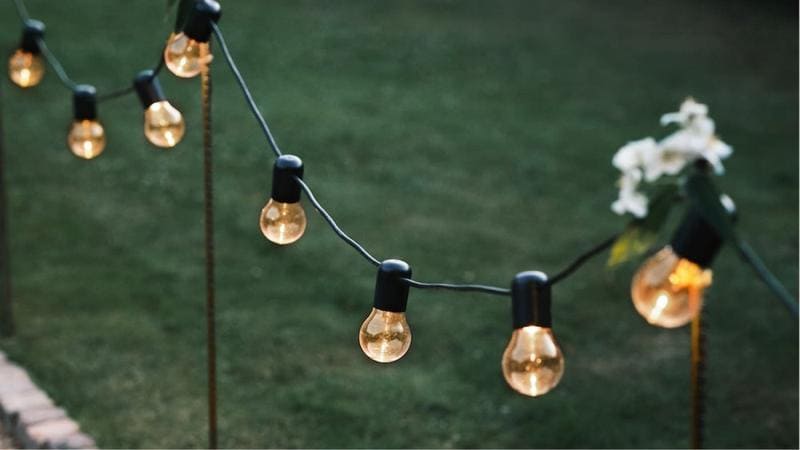
1700 – 2700K: Extra Warm White, a Cozy Hug for Your Home
Welcome to the land of the extra warm white—where every room feels like it’s wrapped in a cozy blanket. Think dining rooms that practically whisper, “Stay for dessert,” bedrooms that scream “sleep sanctuary,” and outdoor spaces that beg for fairy lights and summer cocktails. This range, between 1700 and 2700K, gives off a soft, golden glow that makes everything look a little more charming. From rustic pub corners to high-end hotels, this temperature transforms spaces into havens of warmth and comfort. It’s the lighting equivalent of a fireplace, minus the firewood.
3000K: Warm White, the Smooth Operator
At 3000K, we’re talking about lighting that’s warm, but not too warm. It’s like a perfect cup of tea—inviting, calming, but with just enough energy to keep things moving. This is the ideal light for foyers, reception areas, and counters where you want to greet guests with a “Hello!” instead of a “Whoa, it’s dark in here.” Crisp yet welcoming, it reduces visual imperfections, adding a touch of sophistication to any room without overpowering it. Think of it as your personal lighting butler, always on point, never intrusive.
4000K: Neutral White, the Balance You Need
If Goldilocks had to pick a light, it would be this one: not too warm, not too cool—just right. Neutral white at 4000K creates an environment where focus and productivity reign supreme. Perfect for offices, showrooms, and salons, this light is fresh, vibrant, and, most importantly, neutral. It doesn’t mess with your colors, your mood, or your style. It’s all business, helping people stay alert and on task, while still being gentle enough for everyday use. It’s the “workhorse” of lighting, blending functionality with a dash of flair.
6500K: Daylight, Your Powerhouse Illumination
At 6500K, it’s all about intensity. This is daylight, in all its bold, unfiltered glory. Labs, operating rooms, and places where people work with tiny details love this kind of light. Why? Because it’s sharp, clean, and makes every little thing pop like it’s on display. Imagine a brilliant blue sky on a crisp winter day—now bottle that and stick it in your light fixtures. This is the light that says, “No mistakes here, folks!” Perfect for places where precision is paramount, and guesswork is not an option. If you need to see it all, this is your go-to.
Simplified Color Temperature Guide by Application
| Application | Recommended Color Temperature |
|---|---|
| PARKING/OUTDOORS | |
| Outdoor site lighting, security lighting, parking garages | 3000-4000K, but cooler tones in the 4000-5000K range are most common |
| RETAIL | |
| General retail | 2700-4000K |
| Silver, other jewelry displays (especially diamonds) | Cooler color temperatures in the 3500-4500K+ range |
| Jewelry display (mixed metals) | Alternate between warm (2700K) and neutral (4000K) temperatures based on what is on display |
| RESTAURANTS | |
| High-end spacious restaurants | Warmer color tones (1800-2700K) |
| Small/Quick-serve restaurants | 2700-3500K, some prefer warmer, but not as warm as larger restaurants |
| HOTELS | |
| Hotel lobbies (entrance space) | Warmer tones between 1800-3000K, considering ambiance, space, brand, and location |
| Passages within houses/buildings and common areas | Match the CCT of the passages to the lobby |
| Guest rooms | 2700-3000K for an inviting and warm ambiance |
| COMMERCIAL OFFICE | |
| Office space | 3000-4000K |
| HEALTHCARE | |
| Hospitals | 3500-5000K for alertness and coordination |
| SCHOOLS & UNIVERSITIES | |
| Dining areas | 2700-3500K |
| Classrooms and common areas | 3500-5000K for an energetic atmosphere and promoting alertness |
| GYMS AND FITNESS CENTERS | |
| Exercise and workout areas | 4000-5000K to create a motivating and energetic environment |
| Yoga and relaxation rooms | 2700-3500K for a calm, soothing ambiance |
| MUSEUMS AND ART GALLERIES | |
| Art display areas | 3000-4000K to ensure colors are accurately rendered while enhancing artwork details |
| Sculpture display rooms | 3500-5000K to highlight fine details and textures |
| MANUFACTURING FACILITIES | |
| Precision workspaces | 5000-6500K for bright, accurate lighting, ensuring attention to detail |
| General assembly lines | 4000-5000K to maintain productivity without causing eye strain |
| PHOTOGRAPHY STUDIOS | |
| Product photography setups | 5000-6500K to replicate daylight for accurate color reproduction |
| Portrait studios | 3000-4000K to create soft, flattering light on subjects |
| WAREHOUSES | |
| General storage areas | 4000-5000K to ensure clear visibility and prevent accidents |
| Loading docks | 3500-4500K for optimal visibility while maintaining a safe work environment |
Parking/Outdoors: 3000-4000K—Lighting Up the Night
You’ve got outdoor spaces, and you need them to shine. Literally. Whether it’s parking garages or security lighting, the sweet spot for color temperature here is 3000-4000K. This range gives you that crisp, clear light that says, “Welcome,” but also, “We’re watching, so don’t try anything shady.” It’s a balance of brightness and practicality, illuminating your outdoor world without making it look like an alien landing zone.
Retail: 2700-4000K for General Use, 3500-4500K+ for Jewelry Displays—The Sparkle Factor
Retail lighting is a delicate dance. Too warm, and everything looks a little too cozy, like you’re shopping in grandma’s living room. Too cool, and suddenly, you’re in a sterile warehouse. The 2700-4000K range strikes the perfect tone for general retail spaces, giving products a vibrant glow without overwhelming the senses. But if you’re selling diamonds, gold, or shiny things that make people say “Wow,” you want to bump up to 3500-4500K+. This higher range makes every gem sparkle like it’s auditioning for a jewelry commercial. Bling at its brightest!
Restaurants: 1800-3500K—Mood Over Menu
Whether you’re running a cozy corner bistro or a fast-paced quick-serve spot, lighting plays a big role in setting the vibe. At 1800-2700K, your restaurant becomes a warm, inviting space where every meal feels like a special occasion. For those chic, high-end places, the glow is like a warm hug, but if you’re flipping burgers at breakneck speed, 2700-3500K gives you just enough clarity to keep the energy alive without losing that friendly atmosphere. Think of it as setting the mood before the food.
Hotels: 1800-3000K—Luxury in Every Light
Hotel lobbies and guest rooms aren’t just spaces—they’re experiences. And what better way to welcome tired travelers than with a warm glow between 1800-3000K? Lobbies bask in this golden hue, giving off a first impression that screams “five-star comfort.” In guest rooms, the same color temperature wraps visitors in a tranquil, inviting light, perfect for winding down. Whether it’s a ritzy resort or a chic city spot, this range delivers a soft glow that makes everyone feel like a VIP.
Offices: 3000-4000K—Productivity with a Glow
Workspaces need a light that says, “Get stuff done!” without making people feel like they’re under a microscope. Enter 3000-4000K—bright enough to keep everyone alert and focused, but not so harsh that it feels like a spotlight interrogation. Whether you’re brainstorming the next big idea or just powering through emails, this light ensures your team stays on track without burning out. It’s like caffeine for the eyes.
Healthcare: 3500-5000K—Staying Sharp and Alert
In healthcare, lighting is more than just aesthetics—it’s about keeping everyone on their toes. Hospitals and medical centers thrive in cooler color temperatures between 3500-5000K. This range promotes alertness, helping doctors, nurses, and staff stay sharp during long shifts. It’s bright, clean, and focused, perfect for environments where precision is key. Whether you’re in an exam room or an operating theater, this lighting keeps everyone clear-eyed and ready for action.
Schools: 2700-5000K—From Cozy Cafeterias to Bright Classrooms
Lighting in schools needs to be as versatile as the curriculum. Cafeterias and common areas thrive in the warm, comforting light of 2700-3500K, making spaces feel welcoming and relaxed. But when it’s time to hit the books, classrooms need something sharper—around 3500-5000K to keep students alert and engaged. It’s all about balancing the calm with the energized, ensuring each space encourages learning while keeping the environment cozy where it counts.
Conclusão
The Power of the Perfect Color Temperature
Let’s not underestimate the impact of the right color temperature. Choosing the correct CCT is like finding the right seasoning for your favorite dish. Too much or too little can ruin the entire experience. When you nail the perfect light, you’re not just illuminating a room—you’re setting the stage, creating a mood, and crafting an environment where everything just feels right. Lighting isn’t just a practical necessity; it’s an art form, and choosing the right CCT is your paintbrush.
Ambiance Meets Functionality
From the cozy warmth of a candlelit restaurant to the laser-sharp brightness of an operating room, the right color temperature does more than just brighten up a space. It enhances the ambiance, transforming how we feel, how we work, and even how we see the world. A warmer glow brings relaxation, inviting people to linger, while cooler tones scream efficiency and precision. The right light elevates every room’s functionality, whether you’re sipping wine in a dim-lit lounge or assembling microchips under a 6500K spotlight. Your spaces deserve the right mood, and CCT is your secret weapon to make it happen!